Recently, I finished reading the book 'Don't Make Me Think' by Steve Krug. I have compiled my notes from the book into a pdf, which are available for a free download here. I would highly recommend reading the book since it is filled with amazing examples that will help you understand better but if you wish to go through the notes, feel free to do so.
Below I have listed the key learning points on how to create more effective, efficient, and usable websites —
1. Don't make the users think
When the users enter your website, their minds are filled with several questions and they want them to be answered as quickly as possible.
The best way to do this is to create web pages that are self-evident, or at least self-explanatory so that they don't have to think a lot. Try to avoid using cute or clever names, make links look like links and buttons look like buttons. Follow the existing design conventions so that the user has to think as little as possible.
The appearance of your web page, the terminologies used, and the small amounts of carefully crafted text should all work together to create a sense of nearly effortless understanding.
2. Users muddle through and satisfice.
Very few people take the time to read instructions. Instead, they forge ahead and muddle through trying to get something done quickly. Users don't compare the different options or make the best optimal choices but rather choose the first option they feel will get their work done.
You can get away with a site that people muddle through only until someone builds one down the street that makes them feel smarter because they feel they understand it better.
3. Design for scanning
Users spend very little time reading your web pages than you'd like to imagine. They are scanning and looking for the things they want or things that capture their attention.
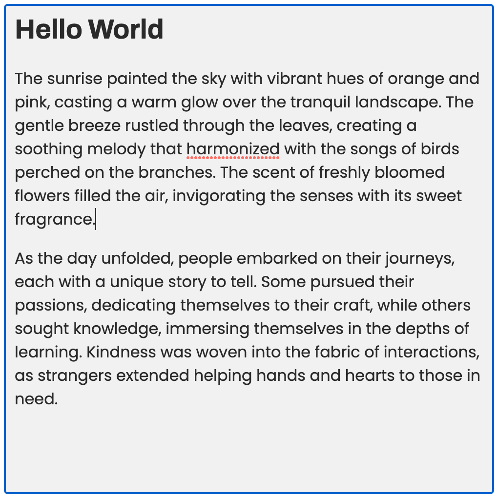
Create effective visual hierarchies that support scanning. Format text, keep paragraphs short, use bullet lists, and highlight key terms that make it easier to read.
Follow existing conventions and design practices, and be consistent. Remove the noise and get rid of everything that doesn't add any value.
4. Help users make mindless choices
Since users are muddling through your websites, you need to help them in making the right choices at every point by avoiding ambiguity. Make their questions easy to answer.
Help them make mindless choices, and if thought is required, provide them with brief, timely and unavoidable guidance in the form of tooltips, "whats this" links, etc.
5. Omit needless words
Your web pages should not contain any unnecessary text. Reducing the noise level of the page makes the page shorter, thus allowing the users to see more of each page at a glance without scrolling and helping them scan better.
Try to make everything self-explanatory or as close to it as possible by cutting down on the text, and the happy-talk that you might see at the starting of web pages, that give you a feel good factor but don't always provide any value. And when instructions are absolutely necessary, cut them back to the bare minimum and get straight to the point.
6. Designing Effective Navigation
Navigation is not just for going from one page to the other, but it also reveals the contents of your website!
The top level of the site’s hierarchy is also called as the Primary Navigation. Users normally expect the primary navigation to be on the top of your webpage. Sometimes, it will also include the space to display the secondary navigation or the subsections.
Once again, using existing conventions help design effective navigation. Also, let the user know where they are using breadcrumbs or highlighting the current location in the navigation. Make it easier for them to go back or go to any other page from anywhere in your website.
7. Create a good first impression
Nowadays, the user may not enter your website through the home page but it is very likely that they might go to the home page next. That is why it is very important to create home pages that leave a good first impression.
The homepage has to convey what this site is about. Good taglines are clear and informative and explain exactly what your site or your organization does. They are ideally 6-8 words long and should convey differentiation.
The homepage has to show what the user is looking for and where they can find it. It needs to establish credibility and trust. But overloading it with information might result in losing its effectiveness.
8. Designing for Mobile
The basic principles for designing for the web and mobile are the same except people are reading even less on smaller screens.
One way to deal with it is to leave things out. You can design the mobile version first based on the features and content that are most important to your users. Then you add on more features and content to create the desktop/full version.
One more obstacle in designing for mobile is that many useful interface features that are dependent on hover are not available- like tooltips, buttons that change shape or color to indicate that they’re clickable.
Make sure that the elements of your web pages have enough design affordances that convey what they are even without hover.
9. Accessibility: Designing for everyone
Your design processes should include thinking about accessibility from the beginning. The single best thing you can do to improve your site’s accessibility is to test it often, and continually smooth out the parts that confuse everyone.
According to a study by Mary Theofanos and Janice (Ginny) Redish, it was observed that screen-reader users scan with their ears. They listen to the first few words of a link or line of text to know what it's about before skipping to the next option. Therefore, a heading or link should contain the important keyboards towards the beginning of the sentence that help screen-reader users scan better.
Below are some useful accessibility tips to get started:
- Add appropriate alt text to every image.
- Use headings correctly.
- Make your forms work with screen readers.
- Put a "Skip to Main Content" link at the beginning of each page.
- Make all content accessible by keyboard.
- Create significant contrast between your text and background.
10. Usability is about serving people better by building better products.
Usability is not about tricking people to buy your products or download your software. There is no problem in persuading people to try something as long as it’s not deceptive.
You don't have to deceive people into clicking on things they don't want. You might have come across those websites where you click on something, to maybe download a pdf booklet, but it leads you to some other website and then some other website before leading you to an advertisement page.
You want to build trust with your users and serve them better by giving them what they are looking for and creating an enjoyable user experience.
Conclusion
The above points may sound very obvious to a lot of you. But the thing is, we often tend to neglect these "common sense approaches to web usability" and end up thinking that everyone uses the web just how we do. When we sit down with others and observe how they use your website, you might be very surprised to know that what you thought was very evident may be invisible to someone else. That is why performing regular usability tests can help you recognize these issues early on and fix them.
If you are looking to learn how to perform your own usability tests when you don't have the budget, or want help convincing your bosses/stakeholders to invest in usability, the book provides very useful insights on these topics.


