Today, we will be looking into how to create a Pie Chart using React and D3.js
Creating a new component
The basic structure of our <PieChart /> component will look like this:
import React, { useEffect } from 'react';
import * as d3 from 'd3';

function PieChart(props) {
  const {
    data,
    outerRadius,
    innerRadius,
  } = props;
  const margin = {
    top: 50, right: 50, bottom: 50, left: 50,
  };
  const width = 2 * outerRadius + margin.left + margin.right;
  const height = 2 * outerRadius + margin.top + margin.bottom;
  useEffect(() => {
    drawChart();
  }, [data]);

  function drawChart() {
    // draw the chart here
  }

  return <div id="pie-container" />;
}

export default PieChart;
Let us take a look at the different props it will be using — margin and outerRadius are used to calculate the width and height of our pie. By having innerRadius greater than 0, we can very easily convert our pie chart into a donut chart as well 🍩 😄
Our component will render a div element which will be containing the Pie Chart.
drawChart function will be responsible for actually drawing our pie chart. It will be called every time the data prop changes.
Defining the data
PieChart will accept an array of objects for the data prop. This is how it will look like —
const data = [{ label: 'Apples', value: 10 }, { label: 'Oranges', value: 20 }];Drawing the Pie
Now, let’s populate the drawChart function. Everything below will go inside this function:
Creating a color scale
First, let us define what interpolations is —
Interpolation is the process of estimating unknown values that fall between known values.
const colorScale = d3
    .scaleSequential()
    .interpolator(d3.interpolateCool)
    .domain([0, data.length]);
The d3-interpolate module provides a variety of interpolation methods for blending between two values. Values may be numbers, colors, strings, arrays, or even deeply-nested objects.
The scaleSequential method maps a continuous domain to a continuous range defined by an interpolator function. We are using the d3.interpolateCool color scale but you can use any other as well.

d3.interpolateCool

d3.interpolateWarm
In simple words, any value falling between [0, data.length] will be mapped to a value in the given color scale. We will be using these colors so that each sector of our pie has a different color.
Appending SVG
// Remove the old svg
    d3.select('#pie-container')
      .select('svg')
      .remove();
// Create new svg
    const svg = d3
      .select('#pie-container')
      .append('svg')
      .attr('width', width)
      .attr('height', height)
      .append('g')
      .attr('transform', `translate(${width / 2}, ${height / 2})`);
We first clear the previous chart before drawing a new one (remember drawChart is called every time the data changes?)
We append an svg inside the div element we rendered. We also append g inside the svg to group our elements together to apply easy transformations to them. We translate this group of elements to the center of the svg
Defining the generators
const arcGenerator = d3
      .arc()
      .innerRadius(innerRadius)
      .outerRadius(outerRadius);
const pieGenerator = d3
      .pie()
      .padAngle(0)
      .value((d) => d.value);
const arc = svg
      .selectAll()
      .data(pieGenerator(data))
      .enter();
d3.arc doesn’t actually draw any arcs yet but it is used to create an arcGenerator which will be used to draw the sectors of the pie. Similarly, d3.pie doesn’t draw the pie but it used to compute the necessary angles to represent our data as a pie.
We then enter the svg group with the computed data. Now, we are ready to actually draw the pie.
Adding Sectors and Labels
// Append sectors
    arc
      .append('path')
      .attr('d', arcGenerator)
      .style('fill', (_, i) => colorScale(i))
      .style('stroke', '#ffffff')
      .style('stroke-width', 0);
// Append text labels
    arc
      .append('text')
      .attr('text-anchor', 'middle')
      .attr('alignment-baseline', 'middle')
      .text((d) => d.data.label)
      .style('fill', '#ffffff)
      .attr('transform', (d) => {
        const [x, y] = arcGenerator.centroid(d);
        return `translate(${x}, ${y})`;
      });
We append a path for each sector. If you notice carefully, we have used the index of each data item to map to the color scale which is used as a fill color for the sector.
Next, we append text elements for each data item and position them using arcGenerator.centroid which returns the center of each sector. That’s it!
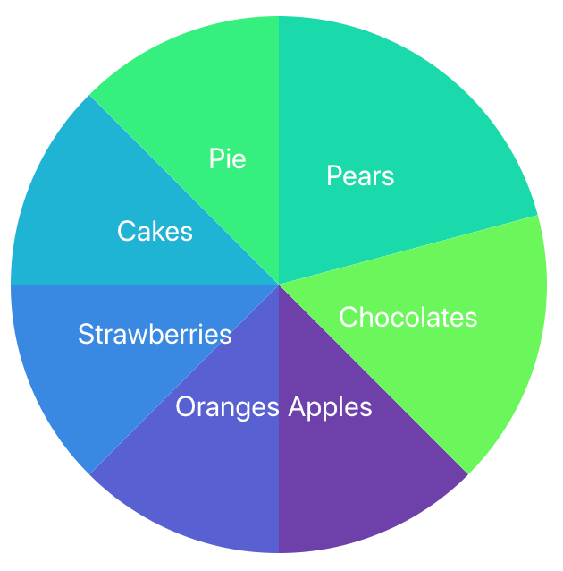
This is how your pie chart will look like ✨


